SICA's Juried Exhibition


this show is captivating, soup to nuts.

It's funny, it's serious, it's professionally done and showcases all of the little intricacies and complexities of each piece, and it doesn't disappoint. It's just young enough to be hip, and just old enough to be taken seriously. A delicate balance. If you're in Long Branch in the next few weeks, please do yourself a favor and check it out. Make sure you say hi to Doug, the gallery director, and officially decorated for nicest man on the planet. He'll tell you all the great details of upcoming shows and cool events coming up. He'll probably also talk you into becoming a member and give you a t-shirt. What size do you wear?

THESIS FINAL IMAGES


DIGITAL DRAWING

coming at ya with some new work. get ready!

Also, looking at a SICA member, here.

http://sica.org/


Organization of an open studio coming soon on 9/17
details pending!


Thesis Opening! Everyone Welcome and Invited! Please Come!


new paintings

!!!
issue: don't know how many paintings will actually fit in the show due to wall space constraints... but i'm hoping it will be more than 2.

artist statement for catalog as follows:
The paintings are representations of facades, values, and structures of art. These facades are in conversation with common notions of commodity and optical pleasure. The gold is a faux gold substitute, a metal powder applied on canvas to create a glossy interior space of what would be walls of stacked gold bars. The faux gold is layered on to create a deep space, which may be entered. The source is a real space, the United States Bullion Depository, Fort Knox, one which few will ever see. The Depositoy is a major structure for the monetary values in the financial system, as well as for the world's economy. Though the values are just numbers, the bars are the physical basis for the structure.

The works reflect a system of value structures, and the facade on which they rest is optical beauty. The only value of these things is in the pleasure we take from the reflective material, and all that we invest in it.

response to critique


In response to the crit from a few weeks ago, I'll address my goals from the crit. I wanted to find out what people get out of looking at the series. I also wanted to avoid technical concerns, and get down to content and inferred meanings.

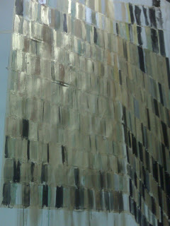
I showed my paintings, and the source image, and talked a little bit about the source image.

The comments were mostly about things that I could do to it to get it to be flashier. i.e. some metallic paint, mirrors, beads, bedazzler, reflective things, etc. I don't think I'm going to go that route, until I've reached a breaking point with the materials I currently am using. I did, however, go to Pearl and get mad metallic paint.

The critique was short, and I don't remember anyone having any other suggestions other than experimenting with materials. There was no formal analysis, and no one seemed up to the challenge of talking about content. Which makes me think the paintings might be unapproachable, or difficult to access...

I take it the critique participants found the paintings a little boring, and not flashy enough. Though I'm not sure if making it more flashy would hurt the balance I am working on to balance a cultural critique with a minimalist painting. I wouldn't want the face value of flashy kitsch gems distract a viewer from focusing on extracting a deeper message. Therefore, I am going to ignore the only suggestions that I got, and keep on doing what I'm doing. Because I like it. And that's the only reason to make anything.
top